Transforming a Wealth Management Platform
M O R G A N S T A N L E Y
In 2022, at Morgan Stanley, I worked with senior designer Shanshan Li to help re-design and introduce new features to a suite of enterprise investment & financial planning tools for ultra-high net worth clients. Used by financial advisors, analysts and wealth managers at the firm, the tool allows users to create plans that support client conversations around complex investments and wealth solutions.

+$16B
Net new assets acquired
to the firm*
P R O J E C T H I G H L I G H T S
+95%
New plans created
since '23
+1.6K
User engagement
* This figure takes into account that we know a WSA report was shared with the client at the time!
"We’re not looking for 10x adoption. We’re looking for quality adoption. Adoption with net new assets."
– Stakeholder
Historically, due to the small UX org at the time—tools were often built without the involvement of UX. This leads to a myriad of issues—there was no regard for accessibility, wonky interaction patterns, an ambiguous strategy on how to add new features—to name a few.
The original platform was launched over five years ago, and while the team found success with adoption and use—there were a number of pain points that needed to be addressed.
O B J E C T I V E
Modernize and improve existing experience and lay the foundation for a long-term product vision.
Address pain points with intuitive solutions
Reduce call volume to help desk
Set the stage for integrations, new work flows
New feature roll-outs
Improve adoption & usage
I N I T I A T I V E S
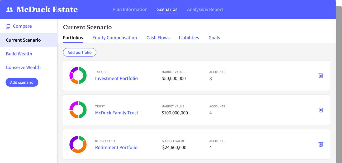
Simplified and improved information aggregation
One of the first things we addressed with the re-design was the information aggregation experience. Previously, users were ping ponging from one section of content to another in order to capture information in a long scroll format. The UI display of information did not scale nicely and overwhelmed users. Additionally, the usage of clunky patterns to view details frustrated them.
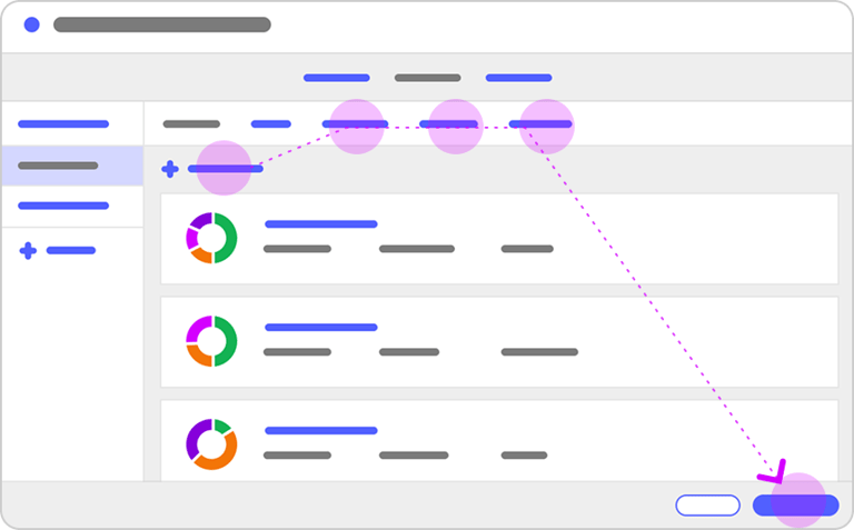
Based on user feedback, the new design simplified what they saw on the page. Instead of a long scroll, we organized the page so different buckets of information could be accessed via tabs at the top of the page. Users would focus on one ‘bucket’ at a time and have the ability to see details captured in one view.
R E S E A R C H
We conducted a study to get feedback on the overall new framework and all participants found the update “less overwhelming”. The new design organized information in a way that was easy for users to digest and understand.
Grouping related information into tabs allowed the information to scale easily. Users would scroll less and it would enable folks to navigate and view details more efficiently. Users expressed the feeling of being guided through steps in a flow with the new approach.
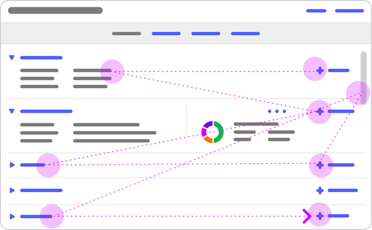


B E F O R E
A F T E R
I N I T I A T I V E S
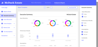
Report creation and customization overhaul
For a tool that was meant to provide reporting for advisors who provide a “white glove service” for their ultra-high net worth clients, the output of the reports left users wanting more. More functions, customization, and consistency.
We designed a robust report building experience that gave users the ability to customize aspects of their report: to easily create, add and remove slides, details, preview and generate a report that would meet all legal and compliance rules. Not to mention a presentation mode that allowed users to share their screen with clients and interact with charts and graphs in real time.

Responsibilities
Led the following initiatives:
Platform framework re-design
Analysis customization experience
Executive compensation integration
Collaborate with team on other ares of the tool
Consult & design ambassador
Mentor
Activities
One of three design contributors across five squads
Collaborate with business, UX & technology stakeholders
Ensure alignment with business strategy
Owner of two weekly design syncs with stakeholders
Weekly sync with business & technology stakeholders to prioritize, demo & review progress
Join sprint & refinement ceremonies
Facilitated d-hoc meetings with SME & user groups for pulse checks
Design-concepts with biz early
T A K E A W A Y S
The team Shanshan and I joined had no prior experience working with designers, but we were able to quickly prove how crucial a partnership with user experience can be.
With a UX team at the table, we were able to:
Leverage the firm’s new design system
Advocate for accessibility
Integrate UX processes in an agile environment
Introduce UX research methods
Insert ourselves early in product defining and concepting conversations
This has been pretty much a dream experience. To work with business, tech, and stakeholders who value and trust UX expertise and give us space to explore and concept along side them. The experience working on this product with this team has been one of the highlights of my career!