Optimizing & Improving the Firm Research Experience for Users
M O R G A N S T A N L E Y
In 2024, I worked on an internal research and deck creation tool used by 75% of the firm's advisors and analysts to learn, consume, and share information with teams and clients.
Within six months, myself, and two designers created an end-to-end proof of concept that added collaborative features to the tool to optimize workflows. We validated the experience with over a month of iterative design and usability research.

2
Research studies conducted: Generative, concept & usability
P R O J E C T H I G H L I G H T S
6 mos
Completed & validated E2E concept
Based on a generative research study we conducted early 2024 and TONS of user feedback and requests—we knew that users wanted the ability to collaborate in a meaningful way. Designing an experience to facilitate collaboration, creating decks, and sharing of content was going to be a key factor in a successful launch.
We also knew that the original product was built almost a decade ago, so it was imperative that the re-design incorporated the design system and took accessibility into consideration.
O B J E C T I V E
Introduce heavily requested feature from users: collaboration and deck creation
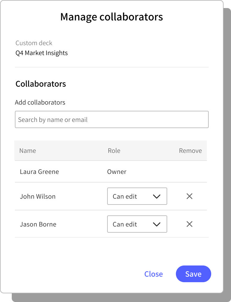
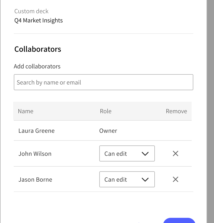
Give users ability to collaborate: share content and folders, or leave comments with team mates
Give users ability to create a deck within the tool
Sharing content and collaborating on decks would diminish time spent on PDF revision cycles and allow for greater consistency of reports
Adopt the design system!
C O N T E X T & I N I T I A L R E S E A R C H
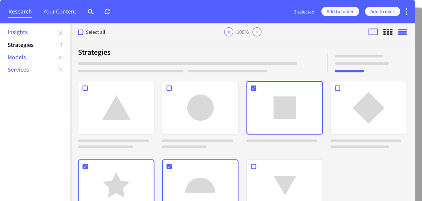
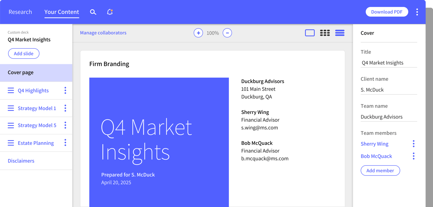
The tool is used by advisors and their teams to consume firm knowledge in a quick and digestible way. The information is displayed in a slide format and users may compile slides into decks to share across teams. A large number of the advisor population will also tap into the tool to create client-friendly presentations or one-sheets to help tell a story or use as a source of information to back a recommendation.
Early 2024, we conducted a generative research study to better understand what users wanted with a re-design. We hypothesized that collaboration would be a big request, but wanted to clearly define what that meant. We also wanted to see if there were any other opportunities to improve the experience. Most importantly, we hoped to better understand how users were collaborating currently, to help contextualize their pain points.
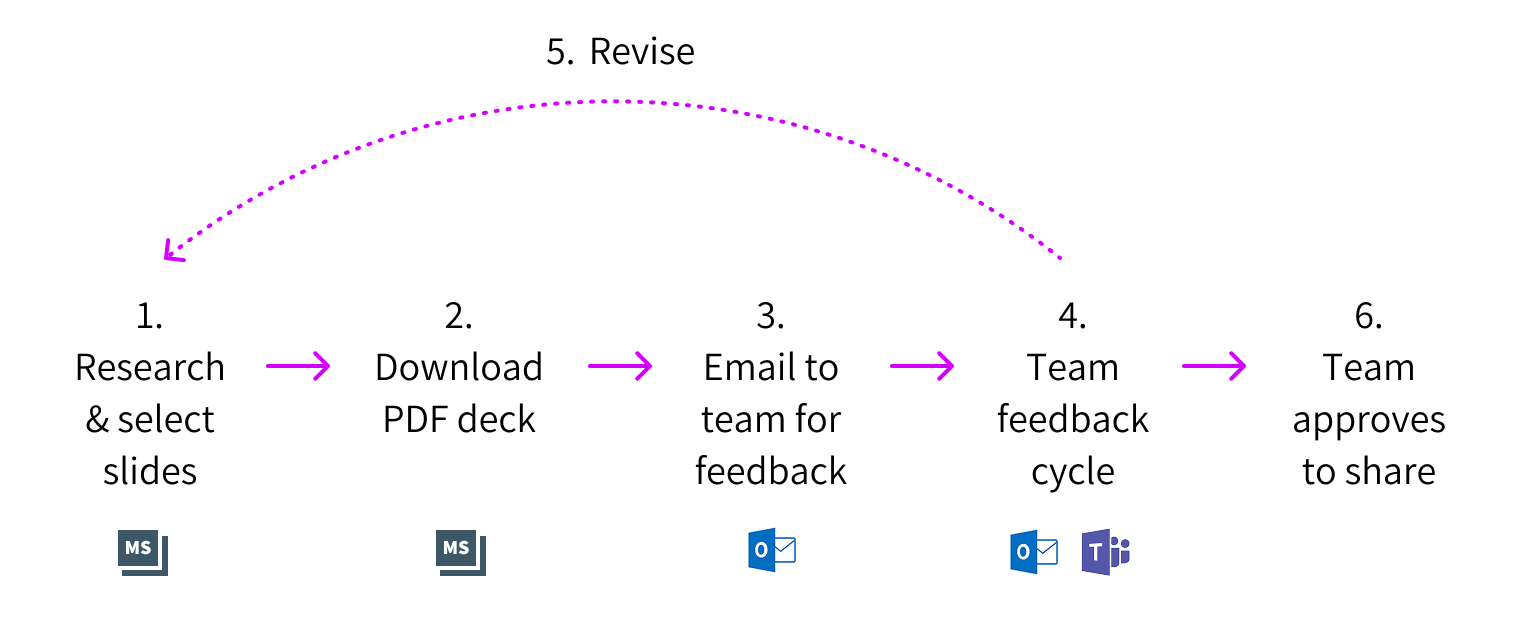
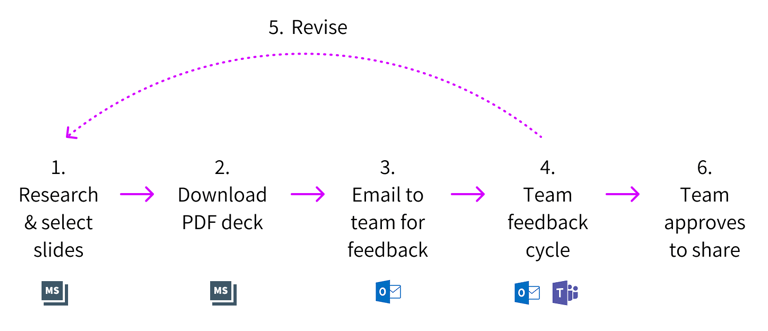
In the study, we discovered that the old experience was quite clunky and time consuming, when it came to sharing decks for feedback. Team member A would look for slides, compile them into a folder, download it as a PDF, then email to Team member B for feedback via Outlook. Team member B could provide feedback in a multitude of ways (reply via email, chat on Teams, or have a verbal conversation), and Team member A would have to circle back to the first step to revise, re-visiting each step and each channel until the deck is approved. Users complained that they'd compile a mess of decks via this working method.
We landed on our primary objectives for the re-design based on the stories we heard (and plenty of prior feedback to support it). In general, it was clear we needed a collaborative deck creation and previewing experience twithin the tool. Additionally, the ability to share feedback or "comments" on decks was going to be a big win—so users wouldn't have to constantly cut new PDFs and send them back and forth via email.
Over the course of the next 5 months, we held two 1-hr sessions a week with our business and tech stakeholders and created an end-to-end proof of concept that introduced collaborative features, along with what we hoped to be huge improvements to the user experience and visual continuity of the enterprise platform in general. Our goal was to finalize on the concept by end of year for tech to begin analyzing and scoping at the start of the new year.
P R E V I O U S E X P E R I E N C E
"This is even better than I expected! We're a team that has people doing overlapping work. I like the idea that I could delegate some of the work with the collaboration feature. And I also like the reverse, where someone else starts it, and I refine it."
Financial Advisor, New York
R E S E A R C H
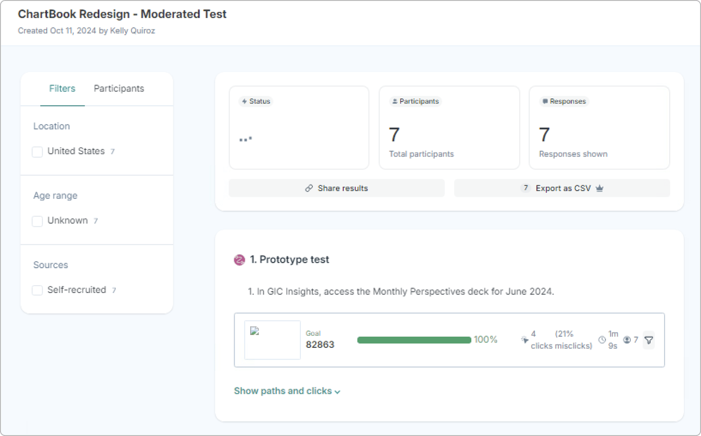
Our previous research session and conversations helped drive much of the design direction, but we needed more feedback to help us move forward with certainty. When we got to a good place with our end-to-end concept, we engaged with our research partners and planned a 6-week long research study with 22 participants to help us fill in the blanks on questionable areas, validate and test the usability of our concept.
Weeks 1-4 focused on validating the new features and helped us to iterate on the design. As we got feedback on items we were unclear about (i.e. labels, icons, navigation), we were able to incorporate the feedback and re-test with a new batch of people the following week. As each week progressed, we heard less questionable feedback and more excitement about the new features in general.
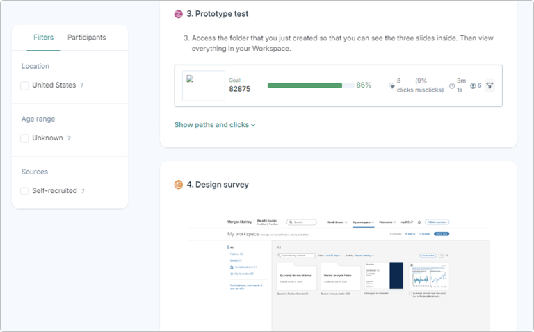
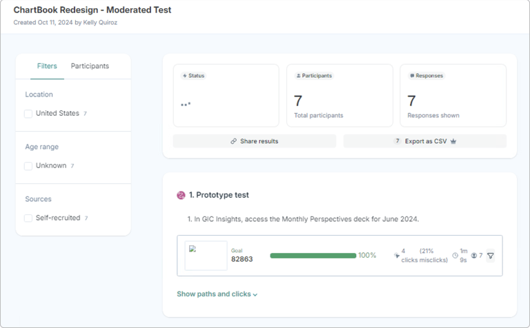
The last two weeks of testing were centered around usability. We wanted to ensure that with the new features and experience, it was easy to use and an improvement. We created a prototype via Lysnna and conducted a moderated test with 7 participants to round out the 6-week study. In general, users were excited for the prospect of collaborating and felt that the updates would improve workflows and decrease the amount of time spent sending files back and forth for feedback.
There were a few items that were flagged at the end of the study. During the first 3 weeks, we were able to de-bunk a theory that certain features would be needed, thereby reducing tech time and UX effort on functionality that users would not engage with. That was a huge win on our part.
In general, thanks to this effort, we knew that we were designing in the right direction and had clear feedback to backup our decisions.
We're currently in the process of refining the design and working with tech partners to define features for upcoming epics and stories.
"Not being able to collaborate is my #1 pet peeve. I'm on a six-person team. Right now we have to save the PDF, email it to each other, and comment manually. This cuts out all that noise. We can collaborate shoulder-to-shoulder in real time."
User, Arizona
P R O J E C T T A K E A W A Y S
No experience that is simple is ever simply made.
We all came together under the impression that the re-design would be pretty straight-forward—utilize the design system, give users the ability to collaborate and leverage existing deck creation tools that existed within the platform. It couldn't be that hard, right?